London has long suffered from the stereotype of being a drab, rain-drenched capital – a city of grey skies, grey suits and even greyer commutes. But illustrator and director Rob Flowers is determined to prove there’s a far weirder, funnier and more colourful reality lurking behind that familiar façade. His BBC crime comedy pilot, Thames View, is a riotous, hyper-stylised love letter to the city’s overlooked corners and oddball characters, and as It’s Nice That reports, it might just rewrite how you picture the capital altogether.
How Thames View turns London’s concrete into a candy coloured crime scene
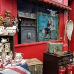
Instead of politely glossing over London’s grey estates, Rob Flowers leans into them, then drenches everything in sherbet tones. Tower blocks become looming liquorice sticks; CCTV cameras glow like boiled sweets; even the Thames looks artificially enhanced,as if someone’s spilled a Slush Puppie into the river. The visual language borrows from 1970s kids’ TV, grindhouse posters and supermarket value-brand packaging, colliding them in a palette that’s more pick ‘n’ mix than police procedural. This chromatic exaggeration doesn’t just make the city look eccentric – it undercuts the traditional grit of crime drama, replacing noir shadows with fluorescent chaos.
Color is treated almost like a supporting character, cueing mood and mischief in equal measure.Locations that might read as menacing in a typical detective show are re-coded through candy hues and lo-fi, almost sticker-book textures. Within this world, the production design leans on:
- Bubblegum-hued patrol cars and signage that parody officialdom
- Day-glo evidence markers that pop against drab pavements
- Oversized props echoing cereal-box mascots and sweet-shop iconography
- Playful typography that feels torn from comic annuals, not case files
| London Staple | Thames View Twist |
|---|---|
| Grey tower block | Mint-green monolith |
| Rainy underpass | Neon bubblegum tunnel |
| Police cordon | Lemon-yellow taffy tape |
Inside Rob Flowers’ world building process for a surreal BBC comedy pilot
To conjure a London where eel pies gossip and police sirens harmonise with singing chimney pots, Rob Flowers began with a sketchbook that looked more like an evidence file of oddities than a script breakdown. Before a single line of dialog was locked, he mapped the city as a living character – block by block – asking what each street would hoard, whisper or hide.His process is part forensic, part folk-tale: doodled relics from East End market stalls sit beside notes on ’70s cop dramas and Half-Remembered Kids’ TV, all feeding into a visual bible that the production team could pass around like contraband. From there, he built a set of “rules of the ridiculous” – a quiet framework ensuring that however wild things get, every floating barge-pub and anthropomorphic billboard still obeys an internal logic. This method, he says, is what keeps the weirdness feeling oddly credible rather than random.
- Visual anchors: historic riverfront pubs, municipal signage and CCTV cameras become recurring motifs.
- Comic escalation: every mundane object is tested for how far it can be pushed into absurdity without breaking plausibility.
- Neighbourhood textures: costume palettes and prop materials are tied to specific postcodes along the Thames.
- Character-cartography: detectives, petty crooks and spectral river gods are all plotted onto an illustrated city map.
| Element | Real London | Thames View Twist |
|---|---|---|
| Estates | Concrete towers | Totem poles of neon washing lines |
| River | Muddy tidal water | Glowing current that leaks clues |
| Corner shops | Late-night off-licences | Portal kiosks stocked with cursed snacks |
| Patrol cars | Marked police vehicles | Rolling mini-fairgrounds with wonky lights |
On set, Flowers’ influence travels from sketchbook to screen through moodboards pinned up in art departments and shared drives dense with colour tests. He treats each prop as a micro-story – a biro chewed into a tiny river monster, a parking ticket that blossoms into a paper flower when ignored – allowing the camera to discover jokes that the script barely hints at. Collaborating closely with costume and production design, he builds layered sight-gags into background action rather than headline moments, encouraging viewers to pause, rewind and re-inspect the frame. The result is a world that feels conspiratorial: every lamppost might be an informant, every fogged-up window a punchline waiting to surface. By hardwiring this visual mischief into the pilot’s DNA, Flowers turns the Thames from a backdrop into a lo-fi, lurid stage where crime, comedy and the city’s own subconscious all jostle for screen time.
From costume details to background props how visual gags transform every frame
Flowers treats every frame like a puzzle of blink-and-you-miss-it jokes,layering in sight gags that reward repeat viewing. A detective’s tie patterned with tiny rubber ducks, a suspect’s mugshot wall plastered with parodies of vintage soap ads, even a stray takeaway menu becomes a punchline if you pause long enough. These details aren’t random; they build a visual lexicon that nudges the viewer to scan the image for clues as much as punchlines. It’s a kind of graphic clutter that feels distinctly London – chaotic, overstuffed, and deeply funny – turning familiar tropes of the crime genre into something sly and offbeat.
The production design leans on a dense ecosystem of graphic and sculptural props to keep the humour firing in the background, even when the script goes quiet. Posters peel off underpasses in lurid colour palettes, fake shop signs undercut the grit with absurd offers, and evidence boards are littered with ridiculous post-its and wonky diagrams that tell their own absurd subplots. In any given scene, you might catch:
- Police noticeboards advertising lost pigeons instead of missing persons.
- Costumes that mash up 1980s cop-show clichés with market-stall chic.
- Street furniture subtly redesigned as smiling, cartoonish characters.
- Background extras reading newspapers with spoof crime headlines.
| Element | Visual Gag | Effect |
|---|---|---|
| Costume | Over-decorated detective jackets | Undercuts macho cop image |
| Props | Fake “found items” in evidence bags | Hints at unseen mini-stories |
| Signage | Parody warning posters | Turns mundane rules into jokes |
Why Thames View proves playful production design is the future of UK television comedy
Forget muted palettes and interchangeable living-room sets: Rob Flowers’ pilot treats South London like a candy-coloured crime scene, where every lamppost, kebab shop sign and betting slip becomes part of the joke. The show’s visual language leans into the hand-drawn wonkiness of Flowers’ illustration work – oversized props, hyper-saturated colour blocking and cartoonish signage turn a familiar riverside into a surreal playground. It’s a reminder that production design isn’t just set dressing; it’s a narrative engine, smuggling in character beats and punchlines before a single line is delivered. In an era of lookalike streaming comedies, this kind of bold, author-led world-building feels less like a stylistic flourish and more like a survival strategy.
What makes the pilot so quietly radical is how its art direction rewires expectations of what “British realism” can look like. Instead of chasing prestige-drama gloss, it embraces the scruffy charm of corner shops and bus stops, then exaggerates them until they feel mythic. This approach opens a path for other UK comedy creators, suggesting that limited budgets can be offset with maximal imagination. The show effectively becomes a proof-of-concept for a future where designers and illustrators are in the writers’ room from day one, plotting gags through architecture, typography and colour. That shift could redefine the grammar of homegrown sitcoms, pushing commissioners to prioritise projects where the set is as joke-dense as the script, including:
- Prop-led humour that rewards rewatching
- Locally specific details that anchor the absurdity
- Illustration-informed sets that feel instantly iconic
- Colour as character, not background
| Comedy Element | Old Model | Thames View Approach |
|---|---|---|
| Setting | Generic flat | Hyper-specific estate |
| Colour | Neutral realism | Cartoon-shining palette |
| Props | Functional | Visual punchlines |
| Design Role | Afterthought | Core storytelling tool |
In Conclusion
In a landscape where London is too often reduced to a postcard skyline or a backdrop of drizzle and discontent, Thames View offers a reminder that the city’s real stories lie in its margins, markets, stairwells and kebab shops. Rob Flowers doesn’t just reframe the capital; he reanimates it, foregrounding a cast and a visual language that feel both specific and broadly resonant.
If the pilot is anything to go by,Thames View has the potential to nudge British crime comedy into stranger,sharper territory – one where the city’s supposed greyness becomes a canvas for bolder,more inclusive storytelling. London, it turns out, is far from boring; it just needed someone to look at it from a different angle.